

Infographics
A picture is worth a thousand words, but what about a picture with words included? That’s exactly what is included in an infographic. It’s a graphic with images, text, diagrams, and charts with the purpose of showing information visually. They give facts and data concisely and use imagery to make it easier for the viewer to understand (Pires). In the visual social media world we live in, people are used to seeing more visuals rather than words. They don’t want to look too hard for information and want it to be brief and understandable. If designers learn how to use the visual elements included in infographics, they have a larger chance of reaching more people (Moritz). There are many types of infographics including timelines, comparisons, graph-based, and image-heavy (Cox), but they all have the same purpose. Similarly to data visualization, infographics can quickly show trends and data while telling a story. Our eyes are drawn to the colors and patterns used, which makes someone more likely to understand (Tableau).
When making an infographic, the creator must decide on a goal and the audience they are targeting before starting to design. They need to know what the infographic will portray and explain, which can help narrow down what should be included (Cox). Then they can design the infographic in a way that resonates with the people who will be seeing it. Of course research is required to find the information and data, but it is important to note that facts should not be thrown in without reason. All the statistics included should have a purpose and relate to the goal of creating the infographic (Neil Patel).
The design process is the fun and creative part, and the most important. The infographic should include clear, readable fonts with a color scheme so the viewer is not overwhelmed. White space, or places with no visuals or text, allow the viewer to focus on the content (Dennison). There should be a balance of words and images. Both are necessary, but too many words or too many visuals can take away from the purpose. When choosing what visual elements to include, you want to keep your audience in mind. People relate to different visuals and learn in various ways (Dennison). A good headline should also be used to grab the attention of the audience (Neil Patel).
My Infographic: Save Our Oceans
Using all of these steps, I created my own infographic with the goal of sharing information about marine debris, or objects found in the ocean that are not meant to be there. I decided I would target the infographic to people concerned with sea life, advocates, students, and researchers. Once I found the most relevant information to include, I found a template on Canva.
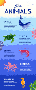
The template had the background of water and some of the graphics. To personalize the infographic, I changed the fonts, added more graphics, and moved pieces around. Then I added all the information and facts.
Resources
For Infographic
100+ ocean pollution statistics & facts 2023. Condor Ferries. (n.d.). https://www.condorferries.co.uk/marine-ocean-pollution-statistics-facts#:~:text=An%20estimated%208%20Million%20tons,15%25%20lands%20on%20our%20beaches.
Hutchinson, B. (2023, October 20). 7 ways to reduce Ocean Plastic Pollution Today. Oceanic Society. https://www.oceanicsociety.org/resources/7-ways-to-reduce-ocean-plastic-pollution-today/
Ocean pollution: Causes, effects, solutions: TDS. Texas Disposal Systems. (2023, August 7). https://www.texasdisposal.com/blog/ocean-pollution-causes-effects-and-prevention/#:~:text=Effects%20of%20ocean%20pollution,-Ocean%20pollution%20has&text=Animals%20that%20aren’t%20killed,bags%20and%20discarded%20fishing%20nets.
Ocean trash: 5.25 trillion pieces and counting, but big questions remain. National Geographic. (2015). https://education.nationalgeographic.org/resource/ocean-trash-525-trillion-pieces-and-counting-big-questions-remain/
Program, N. O. M. D. (n.d.). Where does marine debris come from?: OR&R’s Marine Debris Program. NOS OR&R Marine Debris Program. https://marinedebris.noaa.gov/discover-marine-debris/where-does-marine-debris-come#:~:text=Land%2Dbased%20marine%20debris%20comes,vessels%20or%20platforms%20at%20sea.
Reddy, S. (2018, September 24). Plastic pollution affects sea life throughout the Ocean. The Pew Charitable Trusts. https://www.pewtrusts.org/en/research-and-analysis/articles/2018/09/24/plastic-pollution-affects-sea-life-throughout-the-ocean#:~:text=It%20is%20estimated%20that%20up,suffocation%2C%20starvation%2C%20and%20drowning.
US Department of Commerce, N. O. and A. A. (2008, October 8). What is the biggest source of pollution in the ocean?. NOAA’s National Ocean Service. https://oceanservice.noaa.gov/facts/pollution.html#:~:text=Most%20ocean%20pollution%20begins%20on%20land.&text=Much%20of%20this%20runoff%20flows,as%20a%20result%20of%20runoff.
For Blog
19 warning signs your infographic stinks – Neil Patel. (n.d.). https://neilpatel.com/blog/infographic-warning-signs/ (Module 6)
Cox, L. K. (2023, August 23). How to create an infographic in under an hour [+ free templates]. HubSpot Blog. https://blog.hubspot.com/marketing/create-infographics-with-free-powerpoint-templates (Module 6)
Dennison, B. (n.d.). Practical visual literacy for science communication: Blog. Integration and Application Network. https://ian.umces.edu/blog/practical-visual-literacy-for-science-communication/ (Module 6)
Moritz, D. (2017, November 28). The shift to visual social media – 6 tips for business [infographic]. Socially Sorted. https://www.sociallysorted.com.au/shift-to-visual-social-media-6-tips-for-business-infographic/ (Module 5)
Pires, C. (2022, November 30). 10 types of visual content you need for social media in 2020. Visualmodo. https://visualmodo.com/10-types-of-visual-content-you-need-for-social-media-in-2020/ (Module 5)
What is data visualization? definition, examples, and learning resources. Tableau. (n.d.). https://www.tableau.com/learn/articles/data-visualization (Module 3)

Leave a comment