
Sometimes it’s hard to put things into words. People don’t want to read a long description or use their brains after a long day of work or school. That’s why visuals are so important. They are able to tell a story in a way words sometimes can’t.
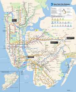
For example, if you were to describe a subway or train system in words, it would take a long time. It would be time consuming and people would be confused. That’s why maps are used.
Data visualization is similar to a map. It’s a way to display information without using many words. The Interactive Design Foundation describes it as the “art of representing data in a way that it is easy to understand.” It can help people make sense of information without reading or thinking too much.
Sarah Illenberger has become a master of visualizing data in a unique and interesting way. She maps statistics or data with everyday objects. Instead of showing a graph to give information, she makes art. This makes the process of learning new information so much more interesting and makes viewers want to learn more. You can see some examples of her work here.


Although it may seem simple to find a statistic and bring it to life, it’s not. There are many important factors that go into making a data visualization. The Interactive Design Foundation describes three elements that make a successful infographic. The first is called “Spatial Substrate.” This means there needs to be space to create visualization. The graphic can be two-dimensional or three-dimensional, but should have an X or Y axis, or both, to give the objects used a value. When using qualitative data, like Illenberger does, numbers need to be given to help the viewer understand what is being described. The second necessary element is graphical elements. These are the visual elements that you see on the spatial substrate. They can be points, lines, shapes, or objects, and are used to show the statistic. Whatever is used should be chosen for clarity and relate to the statistic being visualized. The third element is graphical properties. This includes the size, orientation, color, texture, and shape of what is being shown, and their position along the axis.
Hugh J. Watson explains what makes a good visualization in his article “Data Visualization, Data Interpreters, and Storytelling.” He says the visual needs value beyond the looks, meaning it should be portraying something real. It also needs to be accurate and proportionate to the information the visual is representing. All of this should be done in a simple way. He says simpler charts are interpreted better because they can be understood in a shorter period of time. The goal is to help people understand the idea in a memorable way so they don’t forget the facts.
My Data Visualization
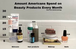
With all of this in mind, I created my own data visualization. It focuses on a statistic from Advanced Dermatology about how much Americans spend on beauty products every month.
You can see that I broke the statistic down into four categories: skincare, hair products, makeup, and nails. To visualize these categories, I stacked my own products to compare the difference in how much people spend on them. Since skincare is what the average American spends the most on per month, the skincare products are stacked the highest. The stacking is mostly proportional to the scale, making the infographic easy to interpret and accurate.
After taking the picture of the products, I edited numbers and text onto the image to give context to what is being compared. Without this context, or key, the visualization would mean nothing.
Making this infographic helped me understand why it’s easier for people to see and interact with visuals rather than words. The objects used in the photo tell a story, and the vital information is given with the numbers and text added. It’s an easy thing to understand and saves people the hassle of reading.
References
Interaction Design Foundation. (n.d.-a). Information Visualization – A Brief Introduction. The Interaction Design Foundation. https://www.interaction-design.org/literature/article/information-visualization-a-brief-introduction
Interaction Design Foundation. (n.d.-b). Visual mapping – the elements of Information Visualization. The Interaction Design Foundation. https://www.interaction-design.org/literature/article/visual-mapping-the-elements-of-information-visualization
Sarah Illenberger’s infographics. ALL MY EYES. (n.d.). https://allmyeyes.blogspot.com/2010/10/sarah-illenbergers-infographics.html
Watson, Hugh. (2017). Data Visualization, Data Interpreters, and Storytelling. Business Intelligence Journal. 22. 5-10.
What is data visualization? definition, examples, and learning resources. Tableau. (n.d.). https://www.tableau.com/learn/articles/data-visualization

Leave a reply to Johanna Casiddy Cancel reply