
Ocelot Chocolate is a European chocolatier brand that focuses on producing healthy and high quality chocolate bars. They grow their cacao at Virunga National Park in Africa, then create smooth flavored bars to be sold around the world. Those chocolate bars are then sold in European stores and on their website. In their collaborations, they have worked with various small businesses to produce specialty flavors and chocolates customized for specific audiences.
Website Design
Colors
When observing their website, it is clear they want to show off the chocolate they are producing. The site is simplistic, focusing on the colors of their chocolate packaging and the real people who bring the flavors to life. The colors used on the bars show how someone feels when they eat the chocolate. Vibrant hues make someone excited and enthused to be indulging in the smooth treat. In his article “Web design color theory: how to create the right emotions with color in web design,” Jerry Cao explains how colors can make someone feel certain emotions. The brighter colors such as orange and yellow tend to energize. Orange especially can represent friendliness and uniqueness, which is displayed on the entire Ocelot Chocolate website. In contrast, green is used to represent the environment, which is where the cacao comes from before it is turned into chocolate. Not many gloomy, dark colors are used on the packaging and website. The bright white background helps one focus on the rich colors of the chocolate and how it is displayed with bright wrappers.
Another way to look at the colors is with the Plutchik Wheel, which guides colors through emotions. Designers use this diagram to provoke certain emotions in the colors they use. Some of the colors used on the website relate to Plutchik’s Wheel. For example, the lighter blue can be related to amazement and the lighter green can mean trust. Both of these adjectives are what the business would want their customers to feel when they receive and try their chocolate products.
Fonts
The fonts used on the website are sans serif. Sophia Bernazzani explains how sans serif fonts represent boldness and confidence in her article “Fonts & Feelings: Does Typography Connote Emotions?”. The type of font works well from the smaller body copy that is used throughout the site.
Organization
The organization and layout of the site use many of the Gestalt principles outlined by Lara Bushe in “Simplicity, symmetry and more: Gestalt theory and the design principles it gave birth to”. The Gestalt principles became popular in the 1920s, starting in Germany, as psychologists tried to find out how we perceive things in the world. The subject has been applied to visual design for decades with principles that explain when and how our minds become aware of visuals in a group.
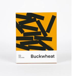
One of the Gestalt principles is simplicity. Our minds first take in everything in their simplest form. On Ocelot’s website and packaging, figures are used to make up unique designs. But each of these designs can be broken down into simple shapes that we are all familiar with. You can see the Buckwheat chocolate is made up of just lines.
Another principle is similarity focusing on how we perceive elements in the same group. If you think of all the available types of chocolate as a group, they use similar designs made up of the simple shapes we discussed. The same colors are also used repetitively, making a cohesive look.
On the website, proximity is used in the way the images are laid out. The principle of proximity helps us understand that elements are connected. The images on the site are all the same size and same distance from each other. They work together to tell a visual story.
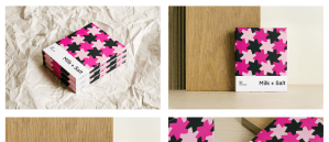
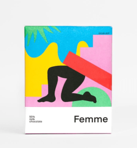
Figure-ground is used in some form on the website as well. This principle explains which elements in a design will be viewed as the focus, while others stay in the background. On the packaging that is heavily featured on Ocelot’s website, certain shapes stand out as the figure, while others become the background. For example, the Femme chocolate bar has what looks like legs running on the packaging. That figure clearly becomes the focus of the design, especially since it is in black.
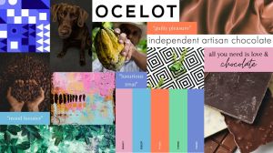
Mood Board
In an attempt to visualize the entire website and the Ocelot Chocolate products, I created a mood board. All the images and words included work together to show how someone feels when they visit the site, and more importantly, when they are eating the chocolate Ocelot produces.

The colors used on the color scheme are from the existing website. I picked the most used colors from the packaging that are bright and vibrant. There are also representations of the smooth and silky texture of chocolate, while other images, taken from Pexels and Unsplash, show real chocolate and cacao. Those are used as an obvious clue to the viewer of what the mood board is focusing on. Chocolate is the reason the small business is successful, so it needed to be featured. The nature aspect is also there with images of leaves because the cacao Ocelot uses is grown in African forests.
The patterns of shapes represent the shapes used on the physical chocolate bars, which are created with molds during the process. These shapes give the chocolate a unique look, rather than the typical squares. A visual metaphor is featured on the mood board too. The chocolate lab represents another way people think of chocolate and also matches the color of the sweet treat.
The text and phrases used on the mood board represent how people feel about chocolate. Sayings like “mood booster” and “guilty pleasure” can be commonly associated with chocolate.
There are also samples of the font used on the website included. The sans serif style is displayed with a screenshot of the website saying “independent artisan chocolate” and in the logo of the website at the top of the mood board.
Throughout this process, I learned a mood board can serve as a diagram to help a website focus on what matters to them and what they want their customers to feel. Specific colors and organizational styles can provoke someone to feel a certain way, and can impact the success of a business.
Resources
Artisan Organic Chocolate Made in Scotland. Ocelot Chocolate. (n.d.). https://www.ocelotchocolate.com/
Bernazzani, S. (2018, April 18). Fonts & Feelings: Does Typography Connote Emotions?. HubSpot Blog. https://blog.hubspot.com/marketing/typography-emotions
Bushe, L. (n.d.). Simplicity, symmetry and more: Gestalt theory and the design principles it gave birth to. https://www.canva.com/learn/gestalt-theory/
Cao, J. (2018, June 11). Web design color theory: How to create the right emotions with color in web design. TNW | Tnw. https://thenextweb.com/news/how-to-create-the-right-emotions-with-color-in-web-design
Interaction Design Foundation. (2023, November 6). Putting some emotion into your design – plutchik’s wheel of emotions. The Interaction Design Foundation. https://www.interaction-design.org/literature/article/putting-some-emotion-into-your-design-plutchik-s-wheel-of-emotions

Leave a comment