
We all know accessing the web isn’t just done on a computer anymore. The internet is at our fingertips every second, 365 days a year. But when we visit websites on our phones or other mobile devices, they look a little different than the traditional layout.
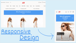
Since the masses started using the web on a variety of devices, there have been changes to how images and designs are displayed. This is called responsive web design, and it’s used everyday. When you open a website on a laptop, it looks a lot different than when you open it on your phone. That’s responsive design. The process resizes images or visuals to make them fit the screen it is being shown on. So as you switch between a tablet, a smartphone, and computer monitor, the same website looks slightly different. The images might be smaller or larger, or use different margins. And the text might be bigger so you can easily read it. When a web page is responsive, you don’t have to zoom in to see aspects when visiting the site on a smartphone.

Here’s an example of Dropbox’s website when viewed on a laptop. The site is wider and fits the screen. It’s easily readable and the images fit well.

This image shows the same website, but on an iPhone screen. The image and text are sized differently to fit the smaller screen, allowing the user to see all the same visuals with proportions matching the device.
How it’s Done
Responsive web design is executed through HTML coding. Web designers set a viewport in their HTML that gives the browser instructions on how to control the page’s dimensions. Below you can see an example HTML sequence for responsive design. The width of the page and images are based on the scale of the device.
<meta name=”viewport” content=”width=device-width, initial-scale=1.0″>
A coding element similar to this is used on Francesca’s website. You can see the first image of the website on a phone screen. The photos and graphics and scaled so the user can see everything. The second image shows a screenshot from the website. The photo used fits the wider screen space and users can see larger text.


Using responsive web design is so important because of the vast amount of web users using their mobile devices. It ensures they have a good online experience no matter where it’s accessed and keeps them coming back for more. In today’s world of changing device sizes, the HTML scale coding helps an image look proper no matter what. So when that next smartphone size or look launches, sites using responsive design will always be ready.
 Katie Coen
Leave a comment