
Let’s say you are doing some research or looking to buy something online. You search Google and come up with hundreds of options at the blink of an eye. You start browsing, coming across new and old, cluttered and clean, colorful and simple sites. But what makes you pick the one you like?
The way a website is designed tells you something about the business or service it’s for. It’s your first impression, and if you don’t like what you see, you’ll probably move onto the next.
Across the web, there are sites ranging from good to bad, and everything in between. A good website is easily identified by the following standards.
- It has a unique but simple layout.
- It has a consistent design.
- It’s easy to navigate.
- It has a clear purpose.
- It can be optimized for mobile devices.
Layout
The goal in making a website should be accessibility. You want everyone who visits the site to be able to easily find what they need. In order for that to happen, the layout must be simple. This means no unnecessary elements on pages, like banners, ads, or pictures that are sized too big or too small. Everything on the site’s pages should have a purpose, meaning adding lots of shapes or pictures that don’t make sense won’t do you any good.
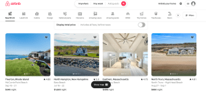
But simple doesn’t mean it has to be boring. A website with an uncomplicated layout can still look aesthetically pleasing. An example of this is AirBnb. The website has clear options of what a user can do and shows perfectly sized, good quality images. It looks neat and intrigues a user to continue their journey.
If your looking for a website with a bad layout, look no further than Craigslist.
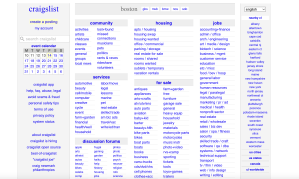
This webpage is not only boring to look at, but it’s too busy. There are way too many options for users, and the confusing layout will turn them away. It’s difficult to read through these options without any real organization. There are also no images to appeal to the visual eye.
Consistency
Even if the website has a good layout, the elements included should be cohesive and look put together. This means all the text should be the same font, similar colors should be used, and visuals should be fluent throughout the website.
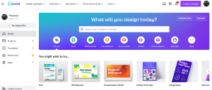
Canva uses the same colors and fonts throughout their website. Their logo, homepage, and even the sample designs incorporate the same blue and purple theme. It’s an eye-catching design that encourages a user to create their own cohesive designs or presentations on the website.
When a website is not consistent, it distracts from the content being displayed. Too many colors or wild shapes take the users eyes off the information and focus them on how scattered a page looks. One of my favorite local Chinese restaurants might serve a great meal, but their website does not follow a theme.
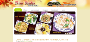
China Garden‘s website uses a variety of fonts and colors that distract from the purpose of the site, which is to show off and sell food. You can see the images are in different sizes and rotated in a random way. No patterns can be found.
Navigation
Arguably the most important part of a website design is the navigation. The navigation allows a user to continue their journey and find each page or product a website is displaying. Therefore, a menu should be prominently featured on the homepage, and every other page too. This menu should be easy to use and labeled with short, but informative headlines. In many instances, websites will use drop-down menus to show many options while avoiding clutter. It also allows a user to access different pages on a website without returning to the home or main menu. A search feature should also be clearly present on the page for the user to find exactly what they need.
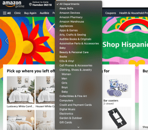
Amazon is a website with a clear menu, showing popular pages that are most useful to customers. It also has a drop-down menu with specific departments to search, allowing the user to find what they need quickly. The search bar is right on top and easily accessible on any page.
If your looking for a bad example, clothing website Zara hides their menu from users right when they open the site. The “hamburger menu” or three lines symbolizing more options is concealed by images that sometimes cover it up, depending on their color. In the screenshot below, you can barely see the menu icon in the top left corner.

It is important not to have too many options on a website. Craigslist shows this very clearly. A user can get easily distracted or confused when they are given more information than they need.
Purpose
The design on a website must be easy to use, but it also should give the user a good idea of its purpose. Clear and simple intentions of the site can be shared with key words, hinting at what a user should be using the site for.
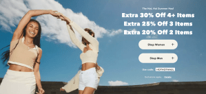
American Eagle directs their customers to shop right away, with discounts and deals that incentivize a user to learn more. The homepage shows exactly what you can find on the page, with options like women’s and men’s clothing.
Mobile Usage
Over 90% of internet users are accessing the web from their mobile phones, according to Exploding Topics. That means that in addition to desktop websites, companies and businesses need to adapt their sites for phones and tablets.
Some websites have done a good job of taking their computer websites and turning them into a platform that can be used on any device.

For example, WFSB Channel 3‘s layout was translated for mobile users by making the features bigger and including a more significant scrolling action that allows a user to see many different stories in one glance.
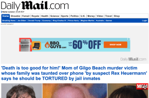
Other websites just kept what they had for a desktop design. The Daily Mail did not change their layout for mobile users. It’s simply the same website, but on a mobile phone, the text is extremely small and hard to read. Below, the first image is their website on a phone. The menu very unclear and the page seems cluttered. The second image is the desktop version.

A bad website is not only painful for the user to see and use, but it can impact one’s success. First impressions matter and a glimpse at a confusing and cluttered page won’t make a user want to stay. So, make sure to keep these five ideas in mind when creating your next website design.

Leave a comment